It’s been a while!! Must try and get back to my normal routine of blogging every week. I have been a tad busy at late! And haven’t had the chance to fit this in to my schedule believe it or not. Been having to get up early to get through the pile of work that needs sorting. Mind you I’m not complaining as I much prefer to be busy and believe it or not your more creative this way as you simply haven’t got the time to ponder!! Love it
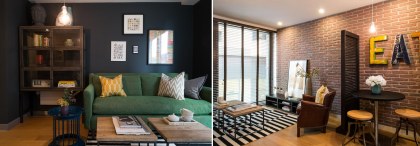
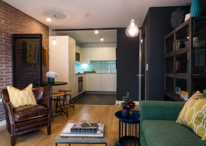
So what’s been going on in the world of David hutton interiors, Finzel Reach which is a re launch of a residential and office development in Bristol by Cubex. DHI was commissioned to design 3 show apartments, marketing suit and office reception. It’s been a great job and one where I have used the tips and what I have been going on about in my blogs ove the last year, take a look at some of the pics courtesy of Cubex.
So let’s get down to business and talk interiors.
I’m going to bang on about it again! DARK WALL COLOURS, it’s definitely a bit of a taboo subject but in my opinion a myth that dark colours make a room look smaller and the Finzel show flats prove this. everyone that saw the old show flat (that was white washed) Â all said the new show flat with the dark colours seemed to be much bigger space than before. Take a look a the before and after shots.
No there are a few key points to making a small space seem larger:
1) Â Zone areas even if you think the space is too small, it can still be achieved and it might be as simple as painted the areas different colours.
2). Scale, don’t be afraid to add in large pieces of furniture. The most common mistake I see all the time is small furniture in small rooms, it’s does the opposite! And whatever you do don’t push all the items against the wall, pull the sofa in or try separating the room with a piece of furniture say like a chair, it will add intrigue to the room
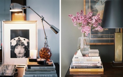
3). Create vignettes, when I say vignettes this is blending so the eye moves along or down, it’s about creating layers so it confuses the eye which thinks there is more space than there really is. So overlapping pictures on a console is a great to achieve this, especially if your have a dark hue on the walls (sorry I couldn’t resist) this will show it off a zillion times more!
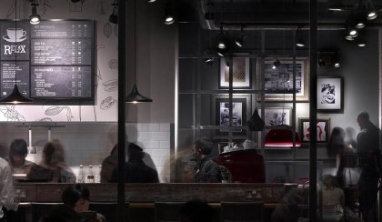
4). Lighting, don’t light the place like a runway! More concentrated lighting is key. Lamps in corners, spot lights diverted on the walls, pendants over a table. This all adds depth and stops the eye from thinking the room is small.
Above picture is a shot form a coffee shop but it shows you what a concentrated lighting scheme does to the space!
It’s all about trickery guys!! but get a few of the keys pointers correct and you will nail your interiors! trust me
Have a great weekend and speak to you next week!


